Case study / 2025
Building the Lipaworld Mobile App: Marketplace × Wallet Integration
View live appGoogle PlayDesigning two focused products under one roof: a marketplace for everyday services and a full-featured wallet for moving and managing money.
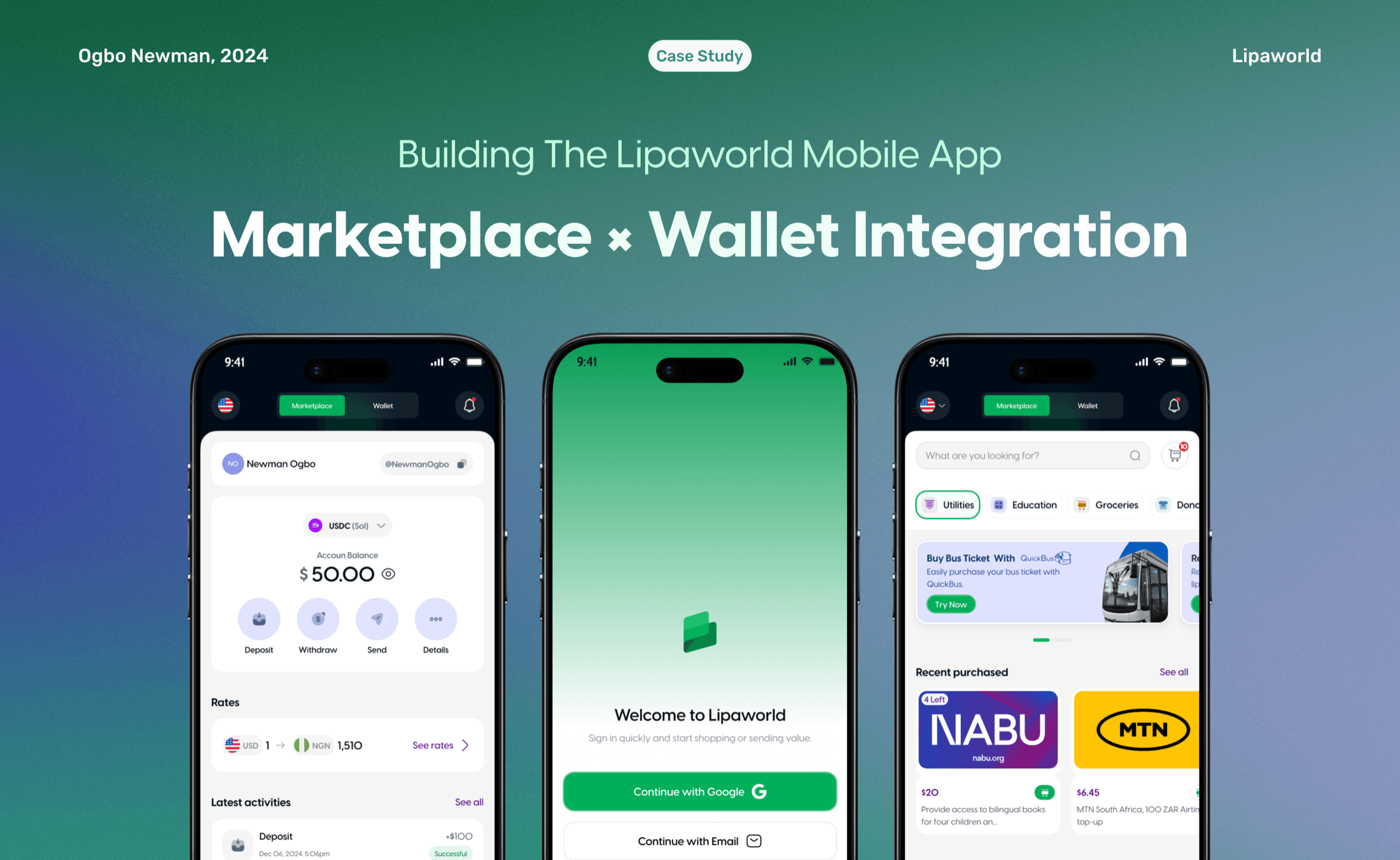
Overview
01 / Context & motivation
Two powerful products, one connected experience.
Lipaworld’s mobile app was designed to balance two distinct user needs: accessing everyday services through a marketplace and managing money through a full-featured wallet. The challenge was not simply combining both, but ensuring neither experience felt compromised. From the start, we treated the marketplace and the wallet as two powerful but different products living under one roof.
02 / The real problem
Different intents, one crowded home.
Users came to Lipaworld for different reasons. Some wanted to buy vouchers and services quickly, while others wanted to send, receive, and manage money—especially from abroad. Blending both needs into one home experience risked confusion, cognitive overload, and a loss of clarity.
How might we give the marketplace and wallet enough space to feel complete, while keeping access between them effortless?
- Keep marketplace discovery fast and immediately understandable
- Give the wallet the depth and clarity of a standalone fintech product
- Make movement between both experiences effortless
- Build reusable flows for recipients, checkout, and money movement
03 / Design thinking & exploration
Separate the products, connect the journeys.
Early concepts blended marketplace actions, account balances, and money movement into one dashboard. The result asked users to process too much at once. Separating the products at the top level created a clearer mental model: browse and purchase in Marketplace; send, receive, and manage money in Wallet.
A clear marketplace and wallet experience
04 / Key product decisions
Marketplace and wallet, each with room to work.
A top-level tab system separates the marketplace from the wallet. Each product has its own focused navigation and flows, but both remain immediately accessible from the same home experience.
Appstore Screenshots
Product Flow Screens
05 / Outcome & reflection
What the separation made possible.
Closely related products do not need to share one interface. Clear separation made both experiences easier to understand, while a consistent system preserved the feeling of one connected Lipaworld product.
Explore more projects
 01
01Let’s Go Drive — Designing a Clearer Car-Rental Journey
 02
02Cuppidart — Designing a Digital Love-Letter Experience
 03
03