Case study / Customer MVP
Let’s Go Drive — Designing a Clearer Car-Rental Journey
An end-to-end mobile experience that brings vehicle discovery, rental details, booking, order tracking, and payments into one coherent journey.
Customer MVP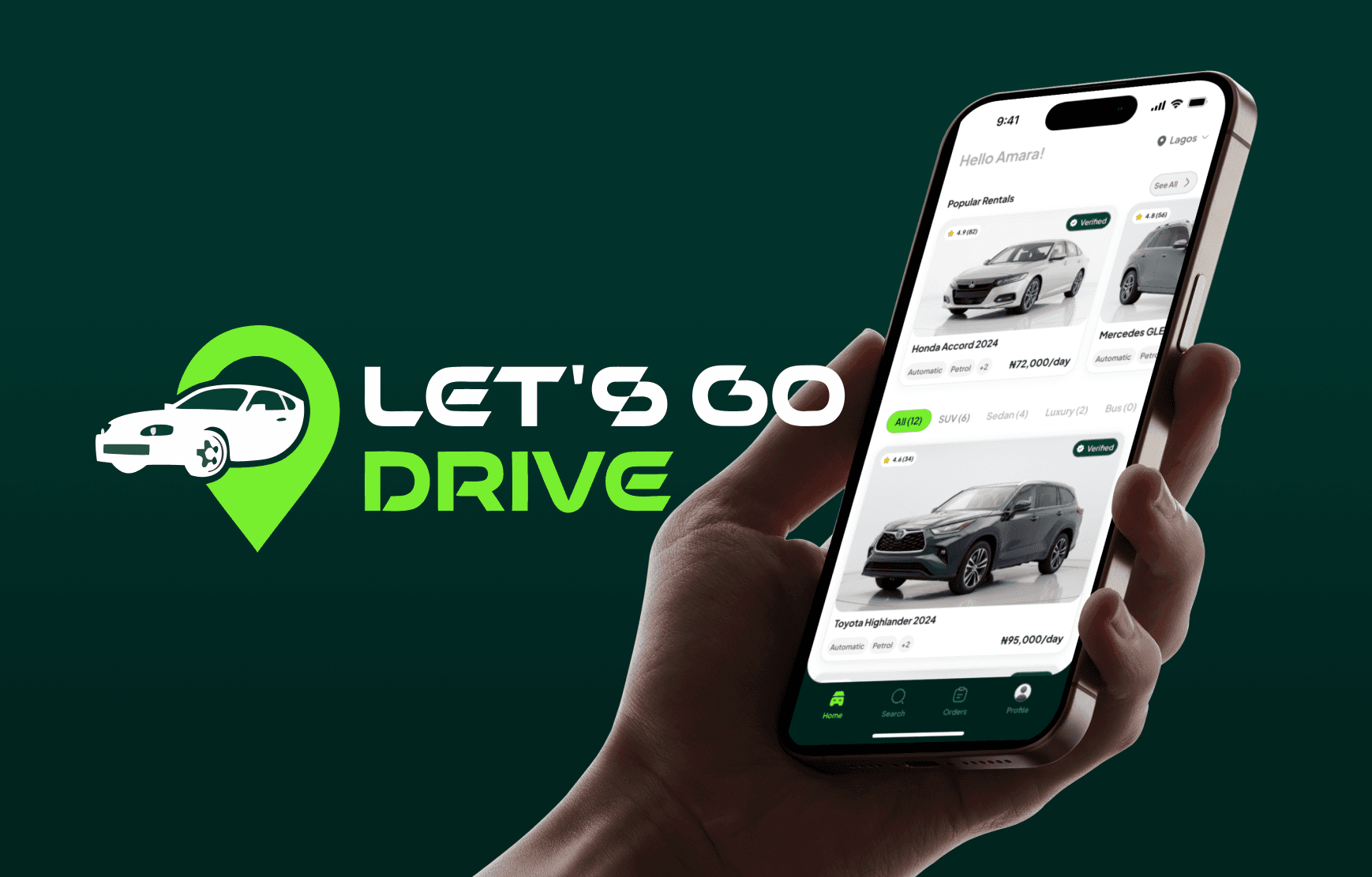
Overview
01 / Context & motivation
Plan the drive, not the paperwork.
Let’s Go Drive explores a complete mobile car-rental experience—from onboarding and vehicle discovery to booking, order management, and payment. The design treats every screen as part of one continuous trip rather than a collection of separate transactions.
02 / The real problem
Too many decisions, not enough continuity.
Car-rental journeys ask people to make several high-stakes decisions—where and when to drive, which vehicle fits the trip, what the rental includes, and how the booking will be managed. When these decisions are split across disconnected screens, confidence drops quickly.
How might we keep people informed and oriented from their first search through booking, pickup, payment, and return?
- Make relevant vehicles easy to discover by location and date
- Help people compare a rental with enough detail to decide confidently
- Preserve context across booking, payment, and confirmation
- Make active, upcoming, and completed rentals easy to understand
- Provide clear recovery states when inventory or connectivity is unavailable
03 / Design thinking & exploration
Organize the product around the journey.
The exploration follows the complete rental journey: brand and splash moments, progressive onboarding and permissions, light and dark discovery, vehicle evaluation, booking, the full order lifecycle, wallet and profile tools, support pages, and recovery states. Reusable variables keep those experiences coherent across themes and changing product conditions.
A connected rental journey from search to return
04 / Key product decisions
Confidence at every step of the rental.
A connected mobile journey organized around the trip itself. Discovery begins with location and availability, vehicle details make the offer easier to evaluate, a guided booking flow preserves every choice, and orders and wallet views keep the rental understandable after checkout.
Begin with trip intent
Location, dates, time, and vehicle needs shape discovery from the start. This keeps recommendations relevant and lets people understand availability before investing effort in a specific car.
Make the vehicle easy to evaluate
Images, specifications, rental terms, reviews, and pricing are grouped into a progressive detail view so people can answer practical questions without losing the primary booking action.
Keep the booking context intact
A guided booking sequence carries the selected vehicle and trip details forward. Review and confirmation screens bring the important choices together before payment rather than asking people to remember earlier steps.
Design beyond checkout
Upcoming, active, and completed orders remain visible alongside search, saved details, and wallet activity. The product continues supporting the renter after a reservation is made.
Design the system, not only the happy path
Shared variables, theme-aware discovery, support tools, and explicit empty and error states make the experience resilient beyond the primary booking flow.
05 / Outcome & reflection
A foundation ready for real-world testing.
A rental product has to communicate continuity as clearly as it communicates inventory. The strongest concepts repeatedly surfaced the current trip, preserved selections between steps, and made operational states visible without overwhelming the core decision.
Explore more projects
 01
01Cuppidart — Designing a Digital Love-Letter Experience
 02
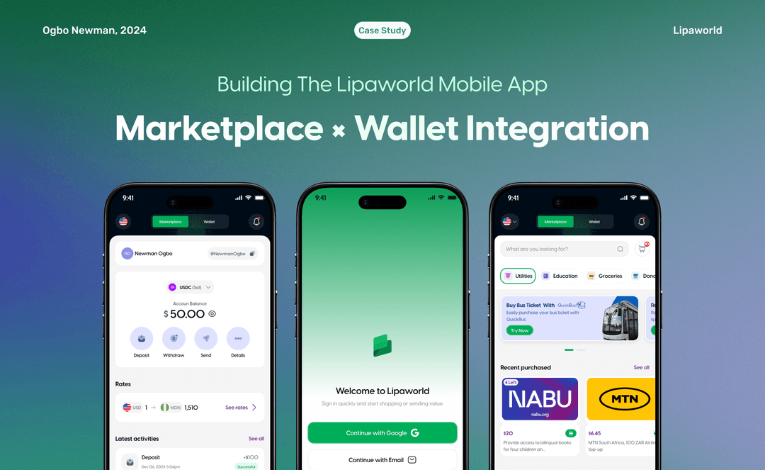
02Building the Lipaworld Mobile App: Marketplace × Wallet Integration
 03
03